
Younger generations grew up with mobile being the primary, if not the only, way to access the Internet. 81% of adult Americans own a smartphone, and 96% of Americans ages 18 – 29 own a smartphone.
Many of my friends do not have computers in their homes, but they have multiple kinds of devices such as e-readers, tablets, and smartphones that they and their children use to access the Internet.
Mobile-first isn’t just Google’s new indexing and ranking update; it is a way of life for many people. Odds are good that, if you’re like our company, over half of your traffic to your auto dealer website is coming from a mobile device.
You can’t afford to not have a mobile-friendly site. What does that mean today?
Mobile friendly dealership websites should be:
Fast loading.
Load speed is one of the top factors used to rank your site. If your site is loading too slowly, that is a huge penalty by search engines like Google.
What is the expected load time? You need a 3 seconds or less loading speed, or risk losing users and suffering a rank penalty in the SERPs (Search Engine Result Pages).
Not only that, but over half (64%) of online buyers will abandon your site and take their business elsewhere if they are unhappy with the loading time and website experience.
In a time when reviews and brand advocates are essential to digital success, you can’t afford to give people a bad digital experience.
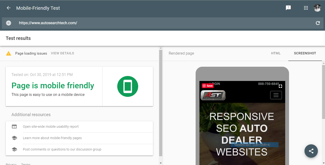
I use this tool all the time to show the development and design team how we can improve our websites. It grades like my tenth grade Honors English teacher – very harsh. But, like she would always claim, better to be hard on me now so I can improve and become the best at what I did later. The same goes for your website. If your webpage is optimized more than the competition, per Google’s standards, Google will probably look more favorably on your page when ranking results.
If you're looking for a teacher that grades a little easier, try
Pingdom or
Think With Google test specifically for mobile.
Go to the Page Speed Insights webpage. Just enter your URL into the search bar and click “Analyze”. In a few moments, the program will generate a report that tells you how your website is doing on desktop and on mobile, and ways you can improve.
How can you get your website to load more quickly?
1. Compress Images. (This is especially important for image-heavy websites, such as vehicle listing pages.)
2. Use a good hosting service.
3. Choose your Apps and Widgets carefully.
4. Don’t use overly complicated design elements.
We know how important load speed is for websites, and we’ve invested considerable amount of time and energy on keeping the AutoSTRADA platform the perfect balance of beautiful design and optimal load speeds.
Get more details on improving load speed from
this article I posted on ApogeeINVENT's blog.
Properly sized images.
One users have arrived at your fast-loading website, the next thing they are going to notice right away is the format of your images.
Your images should be in responsive containers that resize with device being used to view them. To ensure proper image size, you need a responsive website, or a website built on a mobile framework.
Typically for a smartphone, the images need to be set to 100% of the container to be viewed properly. Having a website that looks great on desktop and mobile requires a delicate balance, sometimes sacrificing a little in one area to get the right display in another area.
For example, I was working on some new pages for our
ApogeeINVENT website, and to make it look correct on mobile, I needed to put the CTA buttons off the side of the page, rather than in the middle where I thought they would be more noticeable. Otherwise, when the website shifted to accommodate for a mobile screen, the buttons ended up in the wrong area.
Make sure you are checking your website on all screen sizes to give mobile users the best possible experience.
Correct Font Size
Font size on mobile is important. You need it to be big enough for all uses to read, but not so huge that it looks bad and takes up too much of the mobile screen.
Ideal font size for mobile is 16px. Anything smaller than that, and an iPhone will automatically zoom in, interrupting the user experience.
Clickable elements spaced apart.
Buttons or links on your website should be spaced apart enough to make it easy to click on from any screen.
Include plenty of empty space or “whitespace” to clearly delineate the sections of your website, and the elements that can be clicked.
Make clicking as easy as possible. For example, buttons are easier than hyperlinks and might encourage more interaction from your visitors.
Conclusion
To optimize your dealership website for mobile, follow these simple best practices:
1. Check and optimize your loading speed.
2. Properly size your images to fit on the page.
3. Choose the correct font size.
4. Use enough space to make the site easy to read and click.
How mobile-friendly is your website? Want some feedback? We offer free reviews of your website, so we can let you know how you compare to your competition, and if there are areas you can improve.


